FROM THE ART OF THE MOVIES JOURNAL
Why Are French Movie Posters So Big? The Story of the French Grande
There are some movie posters whose size is difficult to appreciate until you actually stand in front of one. The French Grande is certainly among them.
At around 120 x 160 cm, it is more than five feet tall and covers almost two square metres of wall. Seen in isolation, a photograph can disguise just how large a French Grande really is. Stand in front of one and there is no mistaking it.
We were reminded of that recently by three posters we were preparing for the website: Goldfinger, Barbarella and The Day the Earth Stood Still. All three are French Grandes, with terrific artwork, but they make very different use of the space available to them.

It also prompted a question we had never really investigated properly. Why did France end up with a standard movie poster measuring around 120 x 160 cm?
There are plausible answers that spring immediately to mind. Perhaps French cinemas had particularly large poster sites. Perhaps the dimensions were dictated by lithographic presses. Perhaps somebody simply decided that films deserved bigger advertising.
The real answer seems to be much older than the movies.
“French Grande” is the name most familiar to collectors outside France. In France, the format is usually referred to more simply by its dimensions: the 120 x 160. Those measurements are nominal rather than absolute. Surviving posters can be a few centimetres larger or smaller, something we see regularly in the posters that pass through our hands and which is also reflected in museum collections.
To understand where the format came from, we need to leave the cinema for a while and go back to the French paper and printing trades.
Long before today's A-series paper sizes, French papermakers worked with a surprisingly colourful vocabulary of named formats. Raisin, Jésus, Aigle and Colombier were among them. The measurements associated with these names changed over time and according to use, but they provided printers with a familiar way of describing different sizes of sheet.
Colombier has a particularly long history. It was already established terminology by the eighteenth century, and a French government regulation of 1741 includes a Grand-Colombier, ou Impérial among the recognised paper formats of the period.
It would be too neat to describe that eighteenth-century sheet as an early French Grande. It wasn't. Its dimensions were different, and papermaking and printing altered enormously over the following century and a half. What matters is that Colombier survived as part of the language of the trade.
By the nineteenth century it was also being used to describe the sizes of advertising posters. Alongside the Colombier came the Double Colombier and, considerably larger again, the Quadruple Colombier.
A late nineteenth-century Quadruple Colombier was approximately 122 x 164 cm.
That is already very close to the poster we now call a French Grande.

Jules Chéret's Le Rappel, 1889. A large version measuring around 170 × 120 cm was produced in the Quadruple Colombier format, several years before the first cinema posters.
This was the period in which the French illustrated poster became an art form in its own right. Parisian walls and advertising columns were covered with announcements for theatres, exhibitions, cafés, performers and commercial products. Jules Chéret was among the artists who transformed the look of the streets, followed by names including Toulouse-Lautrec and Mucha.
Their work had to function very differently from a print hanging in a drawing room. A poster might be competing with dozens of other images and signs, seen by somebody walking or travelling past it rather than standing directly in front of it. Scale was part of the design.
There is good contemporary evidence that the Quadruple Colombier belonged to this world before cinema did.
In 1896, the Paris lithographer Alfred Lemercier published a substantial account of French lithographic printing. When he came to poster production, he noted that posters were most often printed on Double Colombier paper and sometimes on Quadruple Colombier. Ernest Maindron, writing on illustrated posters in the same year, recorded the Quadruple Colombier at approximately 122 x 164 cm.
The coincidence of dates becomes interesting because 1896 was also the year in which Imprimerie Pichot printed Marcellin Auzolle's famous poster for the Lumière Cinématographe.
Pichot was not experimenting with an unfamiliar size. Four years earlier, in 1892, the same Paris printing house had produced a colour lithographic poster celebrating the centenary of the French Republic. Surviving examples measure around 120 x 162 cm.
In 1896, Pichot printed Marcellin Auzolle's famous poster for the Lumière Cinématographe.

Marcellin Auzolle's 1896 poster for the Lumière Cinématographe. Printed by Imprimerie Pichot at 120 × 160 cm, its dimensions anticipate the format that would become a mainstay of French cinema advertising.
It is one of the most engaging images from the first years of cinema. Rather than showing some imagined future of the new medium, Auzolle painted its audience. They are watching the Lumière comedy now usually known as L'Arroseur arrosé, and they are clearly having a marvellous time.
The poster measures 120 x 160 cm.
La Cinémathèque française specifically refers back to Auzolle's 1896 poster when discussing the history of the 120 x 160 and describes that size as the basic format of French cinema-poster production.
We have not found a surviving Pichot job sheet that actually calls the Lumière poster a Quadruple Colombier, and it would be wrong to suggest that we have. But the evidence around it is compelling. Large advertising posters of roughly these dimensions existed before cinema, the Quadruple Colombier was recognised by the contemporary printing trade, and Pichot itself was producing posters at essentially 120 x 160 before taking on the Lumière commission.
There is no evidence that French cinema invented the size for itself. It appears instead to have adopted a format that French advertising already understood.

Four years before printing Auzolle's Lumière poster, Imprimerie Pichot was already working at essentially the same scale. This 1892 poster for the centenary of the French Republic measures around 120 × 162 cm.
That also makes the printing-press explanation less straightforward than it first appears.
Large-scale stone lithography obviously set practical limits on what printers could make. Stones were heavy, costly and fragile, and zinc plates later offered advantages for work on this sort of scale. Printing equipment itself could even be described using familiar paper-format names.
But we have found nothing to suggest that a particular 120 x 160 cm press dictated the size of the French movie poster. Paper conventions, printing equipment and the requirements of outdoor advertising seem to have developed together. By the time cinema needed posters, the infrastructure was already in place.
What filmmakers gained from that inheritance was a remarkable amount of room.
A 120 x 160 cm Grande contains 1.92 square metres of printed area. An American 27 x 40 inch One Sheet is around 0.70 square metres and a British 30 x 40 inch Quad around 0.77.
So a Grande offers roughly two-and-a-half times the area of a Quad and close to three times that of a One Sheet.
The comparison is useful, but the three posters that started this article explain it rather better.

The French re-release poster for The Day the Earth Stood Still, carrying the additional title Mission Spatiale, is usually attributed to Constantin Belinsky. Some surviving catalogue records leave the artist unnamed, so for now we prefer to retain a little caution over that attribution.
Gort can be read from the other side of a room. Only afterwards do the smaller details begin to emerge: Patricia Neal in his arms, the flying saucers, the crowd below and the huge yellow MISSION SPATIALE lettering above him.
The composition has a simplicity that works particularly well at this scale. The robot occupies much of the sheet and becomes almost a piece of architecture in his own right.
Jean Mascii's Goldfinger poster does something quite different.

Mascii had far more to squeeze in. Connery dominates the upper part of the poster, but around him are Oddjob, the Aston Martin, aircraft, Bond and Pussy Galore and, running across the foot of the composition, Shirley Eaton's gold-painted Jill Masterson.
There is a lot going on, although it doesn't feel like a checklist of scenes from the film. Mascii controls the hierarchy so that the poster changes as you move towards it. Connery and the large red title do most of the work at a distance; the individual scenes become clearer afterwards.
It is also worth noting that this is a French re-release design rather than the original 1964 French issue. The French Grande had a long working life and films could return to cinemas with completely new artwork years after their first release.

Robert McGinnis had still another answer for Barbarella.
Jane Fonda occupies the centre of the poster, surrounded by the smaller figures and incidents of the film, but much of the upper sheet is allowed to remain deep black space. McGinnis had nearly two square metres to work with and was quite happy not to fill all of it.
The title sprawls across the bottom in enormous coloured lettering. At Grande size, it becomes as much a part of the artwork as the figures above it.
Our Barbarella has also been linen-backed. Grandes were commonly distributed folded - hardly surprising for a sheet approaching five feet by four feet - and those original folds are part of the history of many surviving examples. Linen-backing can provide additional support and allows a poster of this size to sit beautifully flat for display.
The great French illustrators became exceptionally good at using this large rectangle. Boris Grinsson, Roger Soubie, René Péron, Jean Mascii and Constantin Belinsky were among those whose work appeared at Grande scale.
The method of making the posters did not remain static. Traditional lithography gave way to offset printing, photographic material became increasingly important, and eventually poster design moved into a digital world that would have been unimaginable to Auzolle or Pichot.
The size proved harder to dislodge.

A French Grande for a twenty-first-century film such as Avengers: Endgame is produced in a completely different way from its nineteenth-century ancestors, yet the basic 120 x 160 cm format remains recognisable.
Of course, appreciating that history and finding somewhere to put one are two different things.
The size can initially sound faintly ridiculous in the context of a home. Not everyone has a spare five-foot-high wall waiting for a movie poster, and framing one properly is a serious undertaking.
But a Grande does not necessarily need a cavernous room. It does need to be allowed to do its own job.

Interior visualisation showing the scale of the French Grande for The Day the Earth Stood Still.
Smaller framed pieces often work in groups. Grandes generally don't need the help.
On a sufficiently clear wall, one large poster can be visually simpler than several smaller ones. There is less need to arrange a collection around it or find other pieces to balance the space.
The Mission Spatiale visualisation above is a good example. The chair and small tables give an immediate sense of scale, but there is very little else on the wall because very little else is required.
The Barbarella visualisation shows a different possibility. Framed in stained wood and given a clear wall within a softer, more restrained room, McGinnis's artwork feels far less like cinema advertising and much closer to a large piece of graphic art.
 Interior visualisation featuring Robert McGinnis's Barbarella artwork at French Grande scale. The size is substantial, but in the right space the poster can feel remarkably natural.
That is perhaps the more useful lesson. A French Grande does not necessarily need a vast room. It needs enough space around it to be read properly, and a setting that is happy to let one image do most of the work.
Mock-ups are helpful when trying to imagine the dimensions, but we also have a real installation that makes the point better.

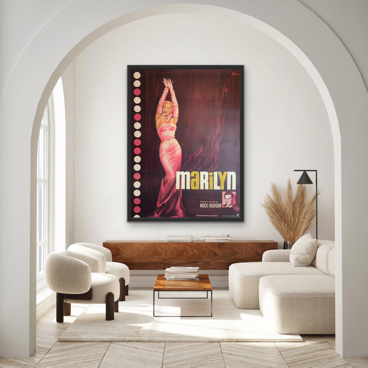
A French Grande in the real world. Our original Marilyn poster hangs within the residential demonstration rooms of specialist home AV installer Jooced.
The French Grande for the 1963 documentary Marilyn, with artwork by Boris Grinsson, is installed within the residential demonstration rooms of a specialist home AV and automation company.
The photograph is especially useful because the setting gives the eye familiar reference points. The poster hangs beside a staircase, beneath a normal ceiling, with the handrail and pendant lights immediately around it. Suddenly 160 cm means something.
Grinsson's Monroe occupies a substantial amount of the vertical space, but the finished piece does not look uncomfortable there. If anything, the difficult wall beside the staircase looks as though it has found its purpose.
The framing is more decorative than the simple dark and timber frames we often use in visualisations, which gives the poster another character again. French Grandes are large enough to take a substantial frame without the artwork disappearing inside it.
The nineteenth-century posters from which the Grande developed were made for public places. Their designers expected people to encounter them at a distance and often in visually busy surroundings. That doesn't mean every Grande uses giant faces and foot-high lettering, but the scale was part of the working brief from the start.
Bring one into a room and some of that behaviour comes with it. From a distance you see the composition, colour and principal figures. Up close there are the things that make an original poster interesting as an object: the printing, signatures, printer details, folds, tiny credits and sometimes the little imperfections acquired during its years of use and storage.
The setting has changed considerably since Auzolle's audience sat laughing at the Lumière Cinématographe in 1896, but the dimensions have proved remarkably persistent. They survived changes in printing, changes in poster design and more than a century of changes in cinema itself.
They also turn out to work rather well indoors.
You need the wall, obviously. But after spending some time with the Goldfinger, Barbarella and Mission Spatiale posters that prompted this article, we are increasingly convinced that this is one movie-poster format whose apparent impracticality is a large part of its appeal.
Our sources and some further reading
For the history of the French 120 x 160 format and its roots in the older French affiche, we consulted La Cinémathèque française, Alfred Lemercier’s 1896 La Lithographie française de 1796 à 1896, Ernest Maindron’s 1896 Les Affiches illustrées, and the Bibliothèque nationale de France catalogue record for Imprimerie Pichot’s 1892 Fêtes du Centenaire de la République française poster.